top of page
WebMD Mobile App Redesign

Increasing user retention by creating a more personalized WebMD experience.
The Challenge
WebMD needs some TLC
We were put into a group of three to create a WebMD mobile app superior to the one available now. Given the wide spectrum of the project and a timeline of 2 weeks, we were faced with a formidable task. Our group sat, sketched, collaborated, and devised a gameplan to create what you are about to see.
The Problem
We need to increase user retention and acquisition
WebMD has learned that people have a difficult time navigating through its massive collection of content. Users want a more personalized WebMD experience and to quickly find, comprehend, and share information. WebMD is also looking to increase its user acquisition and retention.
The Solution
Let's increase personalization and user engagement
People need to want to use our product. Through research, we found that a personalized experience would increase user engagement. To acheive this, we introduced a news feed based on peoples’ interests and medical information. We also added the ability for users to connect and share information with doctors and others.
The Design
Informative and simple onboarding
Once the app has been downloaded, users will be given informational pages about the app and the incentives of creating a WebMD account. Users are then prompted to enter in their information to create an account. These pages are kept as clean and simple as possible to deter people from disengaging from the registration process.


Medical information and history
Next, users are prompted to enter personal information into a series of short forms. This background information will dictate the personalized health tips and articles they receive while using the app.


Editable topic bubbles
After filling out their personal heath forms, users receive topic bubbles which influence the types of information they will receive in their news feed.

Personalized news feed, articles, and sharing
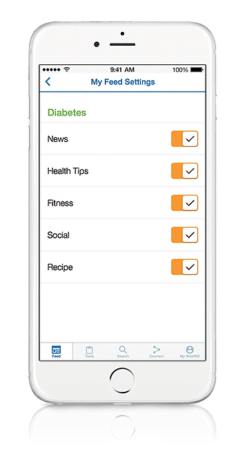
The user now has a personalized health news feed based on their medical information. News feed preferences and topics can be edited at any time. Users can also favorite and share tips and articles with others!


Profile and settings
All personal account data and settings can be managed and edited on the My WebMD profile page. News feed settings can be accessed from the feed page.


Tools and searching
The Tools and Search pages are heavily influenced by survey results. Many of the functions reamain the same as the current app, yet have been organized in a more cohesive manner.


The Process
The scientific method: surveying based on a design hypothesis
We came up with an idea and then created a survey to determine if our design was something users would want.
First Hypothesis: People want a social/news feature that will keep them engaged and increase return visits.
Our survey of +190 people determined that:
-
78% of people want to keep their medical records online
-
Most people only use WebMD when they're sick
-
86% of people self-diagnose using the internet
-
People want a news feed feature

78% of people want to be able to keep medical records online.

86% of people self-diagnose using the internet.
Most people only use WebMD when they're sick
Based on the results of our first hypothesis, we created a second hypothesis and survey to better understand what would keep users engaged.
Second Hypothesis: People want medical information based off of their personal health risks and they want the ability to connect with others.
Our second survey determined that:
-
Most people are comfortable sharing medical information with a secure medical mobile app
-
82% of people have been diagnosed with a medical condition or have a hereditary medical condition in their family
-
Most people take preventative measures to decrease the chances of developing hereditary health issues.

82% of people are diagnosed with a health condition or have a hereditary health condition in their family.

83% of people would feel comfortable sharing such health issues with a secure app in order to receive personalized advice, tips, and preventative measures on that health issue.
Sketches
Now that we had an understanding of what people wanted, we began to mockup designs with pencil and paper.


Wireframes
Our sketches were turned into wireframes and put into InVision to create a working prototype. Once we had our prototype, we were able to conduct usability tests.
Usability testing
Usability testing helped validate our design decisions. We discovered that:
-
People found the interface familiar and intuitive
-
Navigation was simple
-
Users were reluctant to fill out forms
-
People didn't see the "skip" option when filling out forms
As people didn't seem to notice the option to skip the form fill-out at the top of each page, we turned the skip button into a fixed header so that people would see it as they scrolled.

Reflections
Research pays off
I learned a few valuable insights from this project:
-
Don't ask leading questions on a survey - otherwise you'll have to do another survey!
-
Designs and features are only useful if people will actually use them
-
Creating a hypothesis and then proving or disproving it through research leads to strong, user-influenced designs.

bottom of page


